The most powerful font on earth: Helvetica
Know this, so what?
most people, like you and me, are not font designers and don't know anything about typesetting. But this does not prevent us from peeping into a new world through this font.
Apple iOS7 system, Nestle, Panasonic, Lufthansa, New York Subway Station, American Apparel, COMME des GARCONS, self-service Magazine. These brands seem unrelated, but let me tell you-- their logo all use the same font. Helvetica.
Helvetica is a font that was born in 1957. In the age of industrialization, it is popular all over the world with easy-to-recognize and read glyphs. To this day, countless major international brands still use it as a logo font. My opportunity to write this article is that I recently read Magazine B, a brand story magazine, which has an issue devoted to Helvetica fonts. When I first saw it in a bookstore, I was shocked: can fonts also be used as a brand?! After reading it, I was so excited that I thought it was too powerful, so I decided to write an article to praise it as if I was celebrating Helvetica's 60th birthday.
first of all, I am not a graphic design major, nor have I received any font design training. This article is written from the perspective of the reader /font recipient. Why explain? Because the title is too absolute. I know there must be people who are not convinced: "nonsense!" That xx font is the best on earth! "
Yes, in terms of its long history, it is not as good as Bodoni (the cover font of Vogue magazine). [correction: many people have pointed out that the font used by Vogue is Didot, and I checked later that it was\ & quot; a modified version of Didot\ & quot; can hardly tell the difference with the naked eye, so thank you for correcting it! In terms of practicality, it is not as good as Times New Roman (your professors have stipulated that paper must use this font); in terms of likability, it is not as good as Futura (it often appears on movie posters and is said to be the favorite font of genius director Wes Andersen). There are endless examples of punching in the face.
but I insist that Helvetica is the most powerful font on earth. It has stood the test of time and space, and unknowingly, surrounded your life. I will prove that I am not talking nonsense from these aspects:
was born | everyone has been brainwashed by Bauhaus, the three dads of Helvetica, why is it called Helvetica?
become famous | Why do big companies love Helvetica? No feature is the biggest feature
know this, so what?
born | everyone has been brainwashed by Bauhaus
if you haven't observed fonts in nature, you can take 10 seconds to learn about the two main categories of fonts: serif fonts (serif) and sans serif fonts (sans serif). As shown in the following picture, the serif is the one on the left with a small tail at the end of each stroke, and the sans serif is bare.
Helvetica is a sans serif font. When it was born (do you remember the year? ) before the first half of the 20th century, the most popular font was called Akzidenz-Grotesk. (German Grotesk, like French sans serif, means sans serif typeface.) there was a magical "new font movement". The founder, Mr. Jan Tschichold, argued: "every font should have a clear purpose and convey information effectively. Sans serif fonts have both advantages, and you'd better use them both."
it happened that the whole of Germany and even Europe were brainwashed by "Bauhausism", that is, "modernism". Bauhaus not only influenced architecture, painting, and industrial design but also influenced font design by the way. According to the modernist point of view, the font should be like a transparent container, so that the reader can focus on the content of the text when reading, and can not dominate the subject. Helvetica is such a good boy: he looks steady and can be used in all kinds of situations.
now that I know the font type and the background of the times, let me solemnly introduce to you the three fathers of Helvetica, "Fathers of Helvetica"-- Hoffman Eduard Hoffmann, Miedinger Max Miedinger, and Parker Mike Parker.
born | three fathers of Helvetica
Hoffman is the director of Haas Foundry in Haas Foundry, Switzerland. He took over the nearly 400-year-old factory in 1944 (Haas was later bought by the American Linotype printing plant and completely disbanded in 1989). Hoffman saw his factory's top brand: Haas Grotesk font sales are getting worse year after year, thinking that this factory can not be thrown into my hands! It's time to develop a new font! So he hired Mietinger, a very famous font designer and salesman at that time.
left: Miedinger, right: Hoffman
Miedinger is also quite powerful, not to mention the design of a set of Neue Haas Grotesk, this font is compared with the old version of Haas Grotesk, the letter spacing is smaller, looks more compact, and more fluid.
in those days, selling typefaces was like selling insurance, which required door-to-door sales. Hoffman has ingenuity and perseverance, using all kinds of campus sales strategies, tricked big Swiss companies to use its font to do logos. Hoffman increased Haas sales by 20 percent in just three years from 1956 to 1959.
attention, the critical moment has come. Helvetica is about to be born! While Neue Haas Grotesk is recognized, Stempel, a major shareholder of Haas Foundry, is working closely with Linotype, an American printing company. It took me a long time to sort out the relationship between these companies. (face cover) Haas, Stempel, and Linotype work together to make the Neue Haas Grotesk font more suitable for the Linotype printing press, to meet the needs of the international market. At this time, the third "father" appeared.
A
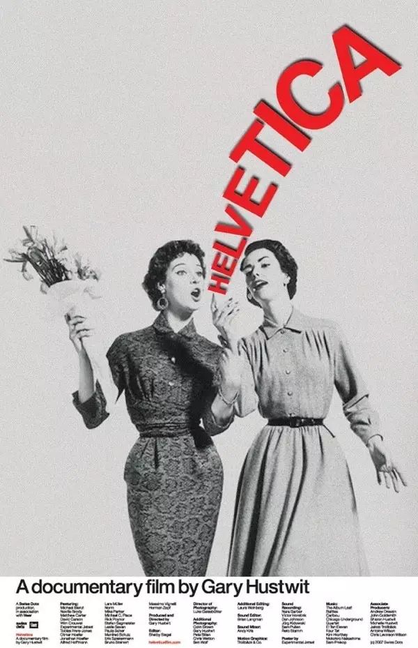
2007 documentary Helvetica from
2007. Mr. Parker died in 2014
as the font director of Linotype, Parker fine-tuned Neue Haas Grotesk to make it more compatible with the printing press. Helvetica was born from this. Parker's first kick earned him the title of "the godfather of Helvetica". He has an amazing output and has designed more than 1000 fonts in his 50 years of working life. He has a particular preference for Helvetica: "this is a font that performs well in different sizes and backgrounds. As long as you outline the background and fill the rest with black, the font will appear naturally."
was born | Why is it called Helvetica?
here's the problem. Neue Haas Grotesk's name is too long for foreigners to remember (mainly Americans are lazy), so a salesman at Stempel suggested renaming it to "Helvetia", which means "Switzerland" in Latin. Hoffman felt that it was inappropriate to use the country name to name the font, and suggested the use of "Helvetica", which means "Swiss", which was unanimously approved by everyone. Do you remember? Haas Foundry is Swiss! 400 years of history!
with an easy-to-remember name, Helvetica became a hit! Of course, it is also proud of itself: the shape and proportion of the font are suitable for printing, and the reasonable distance between letters and words gives the impression of being "upright".
you know that it was a time when there was no computer, so buying fonts is not like clicking a few mouse clicks now. At that time, the money for a set of fonts could be used to buy two cars, so most foundries only bought the most typical letters and then mixed them with existing fonts to reduce costs. For example, the letter R of Helvetica is the most distinctive, with the largest number of buyers. I guess the foundry owner at that time showed off that he was rich: "Man, recently a new font from Linotype is very beautiful, so I quickly ordered a set."
become famous | Why do big companies love Helvetica?
Things go better with our stunning wedding dresses for big bust. Find a design that is perfect for you, they will bring a whole new level to your wardrobe.
I have to say that every step of Helvetica's growth has taken advantage of the times. After the font came out, it coincided with the wave of globalization in the 1960s and 1970s. Many large enterprises are eager to go out to the world, so they need a highly identifiable brand logo. They all lock in Helvetica: visually balanced, stylistically neutral, and modernist. Most importantly, users all over the world can accept it!
the series of brand names at the beginning of the article is the best proof. Pick a few to tell you in detail:
Lufthansa Lufthansa
was founded in 1926. At first, look used serif fonts, then turned to Akzidenz Grotesk, and finally went to Helvetica. All the printed matter in the Lufthansa cabin uses this font uniformly to create a distinct brand image.
Panasonic Panasonic
one of the three days of Helvetica, Parker's father said, "It\ & # 39 | s so firm. It\ & # 39th s not a letter that\ & # 39th s bent to shape. "this tenacious and unyielding characteristic is very much like Panasonic-sturdy and durable.
COMME des GAR cKubo ONS
it is hard to imagine that the fashion designer Kawakubo Ling, who does not follow common sense, would use Helvetica as the logo font, which is a little ironic and a little cute.
New York Subway New York subway station
Helvetica is not only recognized by big companies but also favored by the government. This font is used in stop signs and route maps designed by Massimo Vignelli for New York subway stations between 1968 and 1972.
self-service's biannual Anti-Fashion Magazine
is similar to COMME des GAR c ONS, and self-service also has its rebellious aura. Fashion brands that seem to boast that they are not fashionable all like to become famous with Helvetica.
No feature is the biggest feature
according to the routine of "fashion trend", Helvetica is so popular at the end of the last century that it is time to decline in the 21st century. However, it is not limited by any tricks. Not only did not fall but also more and more popular. The most important reason is that it is constantly updated. The computer is popular, it is quickly electronic, so you can use it in word documents; with more people using mobile phones, it quickly improves so that it can be seen clearly on a small screen. (Apple's iOS font was Helvetica until 2015, and many people complained about it after it was changed.) this up-to-date attitude is the reason why Helvetica is regarded as a classic!
say a few data.
1. At present, the Helvetica family has a total of 60 fonts, including Helvetica Light, Helvetica Black, Helvetica Textbook...
2. Monotype's official website can buy a set of Helvetica fonts, a total of 28, 832 euros
3. Monotype's official website can buy improved Neue Helvetica fonts, a set of 59, 1926 euros
people are jealous, even if the font is red. Many designers publicly declare that they are determined not to use Helvetica because it is too common and boring! I am not convinced. Just like the "frigid style" normcore fire a few years ago, people on the road suddenly became "frigid"-loosely dressed and coldly colored. But it's not a matter of "apathy", it's that the users don't make good use of it. People who walk in this style still dress like this. What is popular has nothing to do with him. I asked some friends who worked in graphic design, and Ling told me that her first choice of English font was Helvetica, because "it doesn't look old-fashioned, it's not too delicate or classical, and it's not trendy." Its biggest feature is that it is not very distinctive. "
knows this, so what?
most people, like you and me, are not font designers and don't know how to type. But this does not prevent us from peeping into a new world through this font. For example, when you go to New York to take the subway, you have an extra way to pass the time while waiting for the bus; for example, when you brush your teeth with a Panasonic electric toothbrush, you can stare at the toothbrush in the mirror and watch the logo vibrate.
Yes, you can't escape. This font has surrounded your life, it exists like air, you may not feel it, but you can't breathe without it.